2021 Investment Portfolio Review
- 6 January 2021
- Mark Pritchard
 Within our client Terms of Business document, we have, since 2013, described what we strive to deliver when selecting investments:
“Although past performance is not a guide to the future, our approach to portfolio construction has tended to see Black Swan portfolios fail to keep pace with strongly rising markets, whilst offering more protection when markets fall.”
“We favour actively managed funds, not because they may claim to outperform an index, but because an actively managed fund has the ability to move money tactically to avoid assets and sectors that are going through a downturn.”
“We want investment decisions to be based upon enthusiasm for an opportunity rather than a fear of being left behind. We believe a good investment manager is someone capable of making money when asset prices are rising and holding onto it when asset prices are falling.”
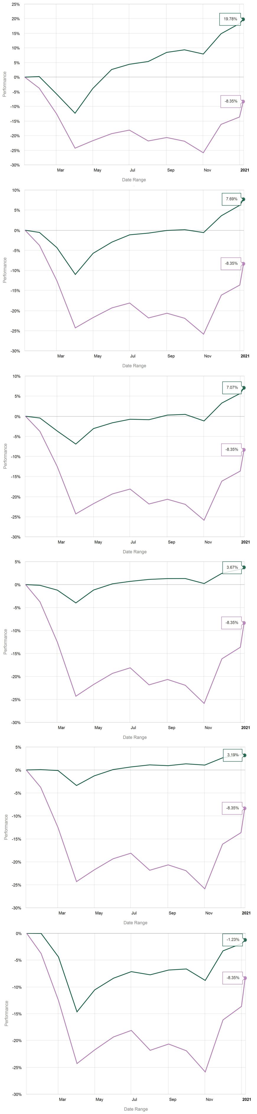
2020 provides a practical illustration of how our approach delivered returns across a spectrum of risk/reward profiles and can be viewed in the accompanying graphs.
The return from each example portfolio is denoted by the green line and shows how each portfolio has performed over the course of the year to 06 January 2021.
Both at the time, and now with the benefit of hindsight, the most pleasing performance aspect is how well the majority of portfolios performed from peak to trough. Our one outlier being the income portfolio, which as with any yield seeking portfolio was hit by the COVID induced economic contraction and consequent dividend cuts from many high yielding companies.
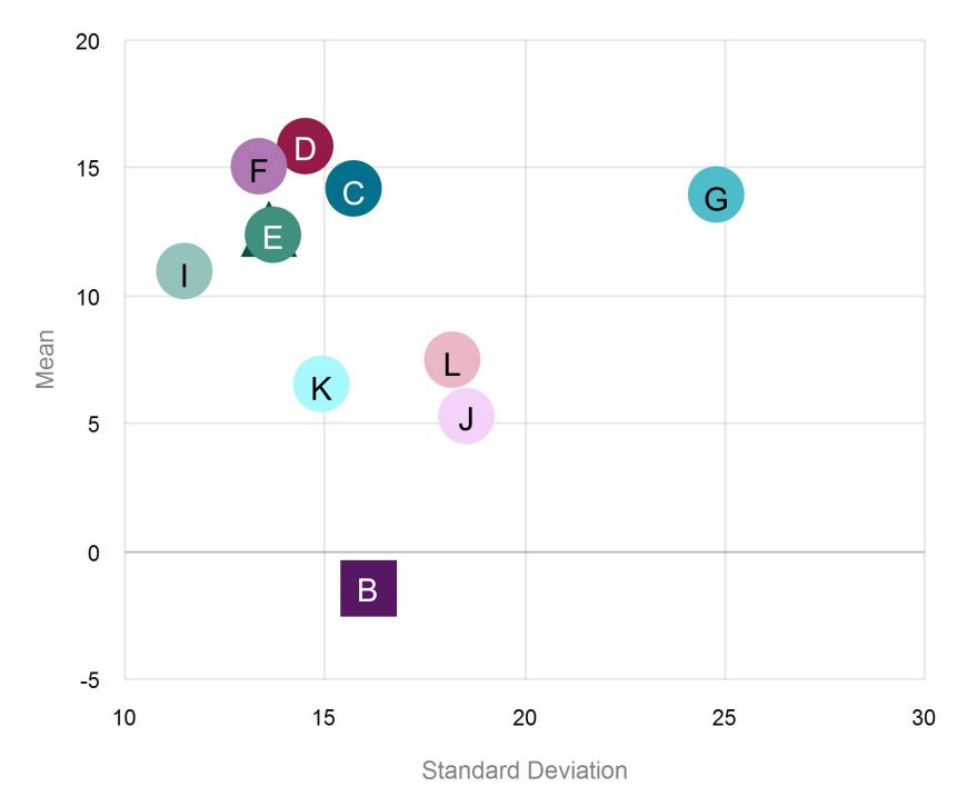
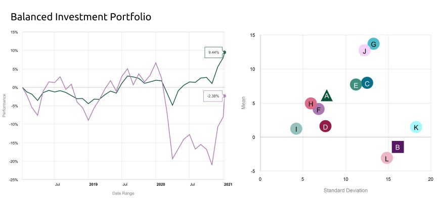
The performance review of January 2020 provided 3 year performance and risk/return scatterplots by comparison to the UK stock market (Morgan Stanley Capital International UK Total Return Index (MSCI)). For completeness we have updated the comparisons, the first graph plots the standard deviation (volatility - a measurement of the movement of an investment from its average monthly return) and returns of the constituent assets within the adventurous portfolio over the three year period to January 6 2020 ((for each asset held within the portfolio). The green triangle (hidden behind E) represents the portfolio as a whole and the claret square (B) represents the UK stock market.
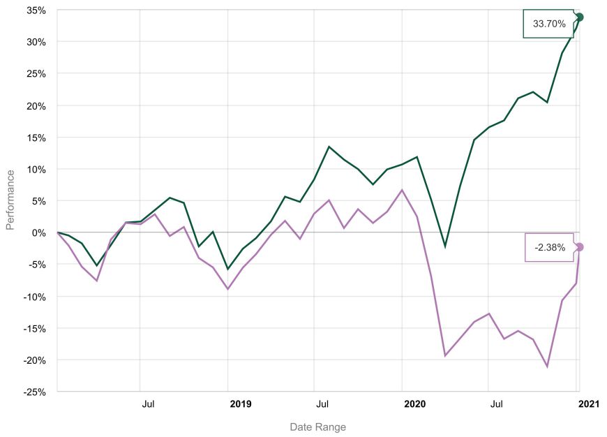
 Net of all fees and charges, the return of the investment portfolio over this period equated to 33.70% with volatility of 12.6%, this compares to the UK stock market with figures of -2.38% and 16.12% respectively. The adventurous portfolio therefore produced a higher return for less risk than the market and displayed in the following graph.
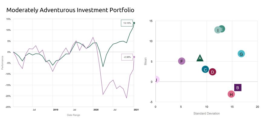
The following two charts provide the same information for the Moderately Adventurous and Balanced portfolios.
As ever, past performance is no guide to the future, the value of an investment will go down as well as up and you may get back less than the amount you invest.